Remapping international partnerships
Does your institution use world maps to visualise its international reach? Many of us do, and often without reflecting very deeply on the challenges that surround this practice and the information and imagery that these maps convey, both intentionally and unintentionally.
In this article, we invite you to join us in taking a more critical look at international partnerships mapping as a common practice in higher education internationalisation. We start our reflections with a quotation from John Rennie Short’s The world through maps: A history of cartography, in which he noted the following:
"Maps are neither mirrors of nature nor neutral transmitters of universal truths. They are narratives with a purpose, stories with an agenda. They contain silences as well as articulations, secrets as well as knowledge, lies as well as truth. They are biased, partial, and selective."
What do these observations mean in the context of international higher education, where partnerships maps generally serve the purpose of illustrating the global reach of higher education institutions around the world? If maps are aimed at putting the spotlight on a particular institution and at showcasing its international attractiveness by illustrating how well connected it is internationally, what other agendas might they invoke, knowingly or not?
Traditional map projections
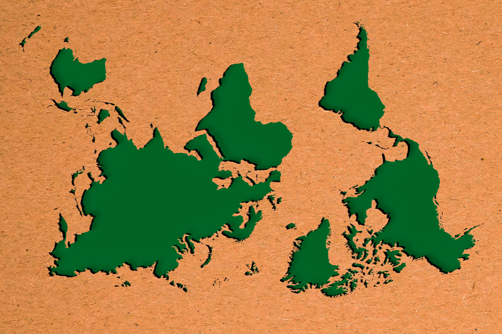
A telling example concerns the hidden narrative of international partnerships maps emerging from the way in which they portray our home planet Earth. As critical cartographers have pointed out, world maps are neither objective nor neutral. They embody and maintain global power relations – as in the case of the Mercator projection, which was named after the Flemish geographer and cartographer Gerardus Mercator who developed it in the 16th century. His projection has hugely informed and influenced how we have been visualising the world and is still widely used today, including in international partnerships maps.
The landmass of Africa is actually as big as Europe and countries such as the United States, China, India and Japan – all combined
However, the Mercator projection, which uses longitudinal and latitudinal lines on a flat surface, has been criticized for distorting the size and location of the Earth’s continents. For example, it generally represents Europe as disproportionately large in relation to other regions such as Africa and Oceania. Regarding Africa, Kai Krause, a German software and graphical user interface designer, developed a graphical depiction called ‘The true size of Africa’, which was an attempt to illustrate the immensity of the continent by creating an image showing that the landmass of Africa is actually as big as Europe and countries such as the United States, China, India and Japan – all combined.
For global geopolitics, a critical reflection on the Mercator projection begs the question of whether maps using it are in fact power tools that perpetuate Eurocentrism and a colonial imagery. We must then also ask ourselves whose interests are served by continuous misrepresentation. Furthermore, we must consider the implications of using such maps as the basis for how higher education institutions showcase their international partnerships. For example, in a field where engagements between institutions in the Global South and their counterparts in the Global North are often characterised by power imbalances, who benefits, even unintentionally, from perpetually understating the size of Africa?
In short, international partnerships maps are often less benign and straightforward than they seem. In addition to the many questions and concerns that emerge regarding use of the Mercator projection, still other challenges are linked to whether and how maps can truly represent partnerships.
Other alternatives
If we take up Short’s notion that maps contain both articulations and silences, as quoted earlier, what could this mean for an international partnerships map? While such maps typically indicate the location of partners by using lines, dots or pins, details such as the names of the partner institutions generally remain silent, particularly in static, non-interactive maps. They also tend to not communicate differences among the partners in terms of the type, focus, intensity, duration, activities and stakeholders involved in the partnership in question. The result is a world centred on the institution making the map, with partners as a faceless supporting cast.
While some aspects of partnerships are made visible through such maps, other information remains invisible. We usually learn very little about the nature of the partnership itself, especially regarding how well it is working, whether all stakeholders involved benefit from the partnership and what impact it has had. Globe-spanning lines connecting the home institution with partners also imply worldwide coverage, when the global partnerships landscape is heavily skewed to certain regions, nations and institutions.
We must raise awareness about the messages that international partnerships maps convey, both intentionally and unintentionally
As we have illustrated here, we agree with Short’s assertion that maps are "biased, partial, and selective", and as international educators we consider it our responsibility to do something about it. An important first step is for us to critically reflect on dominant mapping practices. In doing so, we must raise awareness about the messages that international partnerships maps convey, both intentionally and unintentionally. It also means that we must aim to improve our mapping practice, individually and collectively. This could entail using alternative projections such as, for example, the Peters projection, which aims to represent the countries of the world more equitably, showing their true size and proportion to one another. Taking remapping attempts even further, have you come across South-up maps that use South instead of North at the top of the map? Have you considered the double-sided disk projection developed by Gott, Goldberg and Vanderbei? And what about indigenous mapping practices and decolonial cartographies?
We stand to gain a lot from engaging critically with the tool of partnerships mapping, as it allows us to consider how we can portray international partnerships in more informative, equitable and inclusive ways. Doing so will also facilitate a much deeper engagement with our partners themselves and encourage us to recognise and address imbalances in the current global partnerships landscape.
If you would like to learn more about the ways maps used to visualise HEIs’ global reach can be improved and how the landscape they describe can be rebalanced, be sure to visit our poster session ‘Remapping international partnerships: Towards a more balanced landscape’, Poster 213 at the 2023 EAIE Conference and Exhibition in Rotterdam.